Our Textual Analysis
Leonie's Film Poster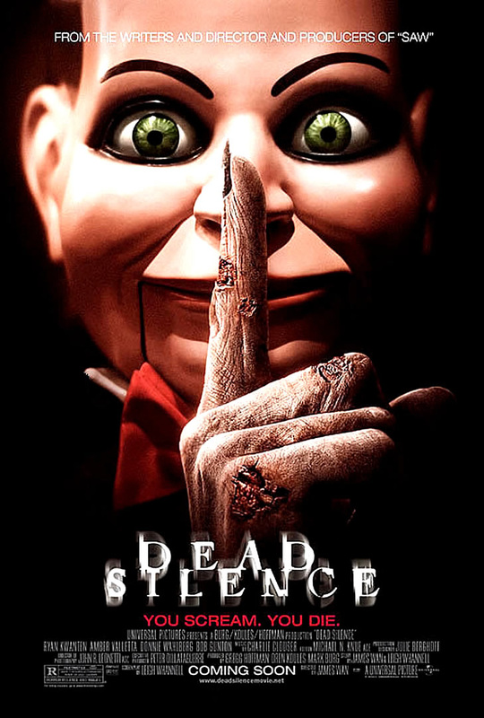
|
Leonie's Magazine
|
|
Film title: Dead Silence
Release date: March 2007 Director: James Wan Production/financing company: Production – Universal Studios, Twisted Pictures, Evolution Entertainment. Finance – Universal Studios. Principle cast: Ryan Kwanten (as Jamie Ashen), Amber Valletta (as Ella Ashen), Donnie Wahlberg (as Detective Jim Lipton), Bob Gunton (as Edward Ashen), Judith Roberts (as Mary Shaw), Michael Fairman (as Henry Walker), Keir Gilchrist (as Young Henry), Enn Reitel (as Billy (voice)). Sub-genre: Horror, supernatural, thriller, mystery, psychological, cult film. Film information: The writers, director and producers who made saw made this film – hence the creepy ventriloquist doll. Fact: the Saw puppet is also featured in Dead Silence. Synopsis: Jamie Ashen and his wife Lisa receive a mysterious ventriloquist doll, "Billy", in an unmarked package. Wondering who sent the doll, Lisa recalls a poem about a woman named Mary Shaw ("Beware the stare of Mary Shaw. She had no children, only dolls. And if you see her do not scream; or she'll rip your tongue out, at the seam. And if you see her remember this, the only thing that can stop her is dead silence.") Jamie disregards this and leaves to get dinner. Lisa plays around with Billy and poses in the mirror. Then all the sounds disappear and Billy comes to life, attacking Lisa. Later Jamie finds Lisa dead with her tongue ripped out, and Billy lying near her body. Jamie discovers that Billy belonged to Mary Shaw, a ventriloquist from his hometown of Ravens Fair. While in Ravens Fair, Jamie visits a few people including his wealthy father, Edward and his new step-mother, Ella. Everyone Jamie meets dies apart from besides Edward and Ella. He later on discovers who Mary Shaw was; she was a famous ventriloquist whose ambition was to make the perfect puppet. At one performance, a young boy named Michael heckled her, saying that he saw her lips moving when performing with Billy and went missing shortly after. Mary was blamed for the disappearance, and the villagers killed her. Her final wish was to turn her body into a ventriloquist's puppet and to be buried with her 101 puppets. A young Henry wandered into his father’s mortuary and accidentally knocked the coffin over. Mary's body briefly came to life and approached Henry, but he survived by covering his mouth to keep from screaming; Mary Shaw can only kill her victims when they scream. At the theatre, Jamie finds Shaw's dressing room and discovers an old book with plans to make the perfect puppet. Jamie confronts Edward and learns that Michael was his great-uncle—with help from the other villagers; Michael's family murdered Shaw by forcing her to scream and then cutting out her tongue. The men involved were killed off one by one, found with their tongues ripped out. Their wives, children, and children's children all suffered the same fate; Edward deliberately drove Jamie away to spare him, but Shaw will now come back for them. (Specific conventions) Tagline: ‘You scream, you die’. Credits: ‘From the writers, director and producers of Saw’ (Director James Wan). Quotes: There are no quotes featured from the film on this film poster. The closest quote to the film is the tagline – ‘You scream, you die’. Main image: The main image is of a ventriloquist doll that is featured throughout the film (named Billy). The doll is smiling and looking towards the audience for that extra creepy effect. Due to the main image being a close up shot, the audience will be able to see the detail in the old woman’s decaying hand in a shushing pose on the ventriloquist doll’s lips. This suggests that the doll is being possessed throughout the film. Target audience: Rated R – anyone aged 15 and up, i.e. teenagers, young adults and adults. Mise-en-Scene Lighting: The lighting of the main image is very dark, only showing light on the ventriloquist doll’s face and the old woman’s hand. The darkness vignettes around the main image making it appear to have a shadow around the poster. Throughout the film, a lot of darkness is shown due to the Mary Shaw character attempting to make the other characters scream. Having the black background on the main image suggests loneliness, depression and afraid. NVC: In the main image, the ventriloquist doll is smiling toward the audience suggesting that he is up to no good. Also, the old woman’s decaying finger held up against the doll’s mouth suggests that she is controlling the doll and is seeking revenge for something that had happened to her. Setting: Due to the lighting of the main image and the close up camera shot, there is no setting, only a black background. Costume: The ventriloquist doll is wearing a black tuxedo with a white shirt and a red bow tie. This makes the doll look creepy instead of it being in casual doll clothing like the Chucky doll. Props: The prop used for the poster and throughout the Dead Silence film is the ventriloquist doll named Billy. Camera (framing and shots): Close up shot of a ventriloquist doll (featured throughout film) and an old woman’s hand held up against the doll’s lips in a shushing pose. Colour: A lot of dark colour is used for this poster to represent the horror theme. The bright lighting used for the main image only focuses on the ventriloquist doll making it seem that the doll is the main prop used throughout the film. Typography (anchorage, font type): The typography used for the title of the film – Dead Silence, stands out the most compared to the rest of the typography used for the poster. It is in a white font that appears to be distorted. Mood and styling: The mood and styling of the Dead Silence film poster does suggest that the film is a horror. The creepy elements of the poster is the old woman’s decaying finger which suggests she is dead, and the ventriloquist doll. Dolls in the horror film industry are seen as iconic. Liz's Film Poster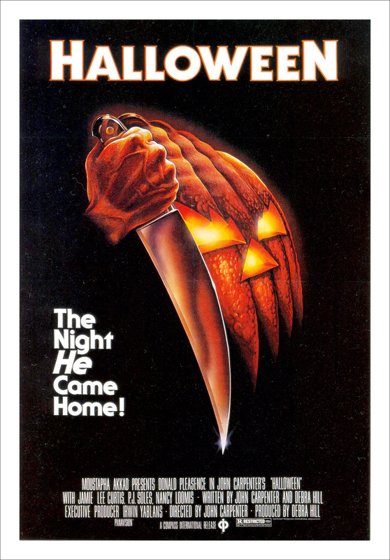
Title: Halloween
Release date: 1978 Director: John carpenter Producer: Debra hill Production/financing Company: Falcon International Productions Principle cast: Donald Pleasence and Jamie lee Curtis Sub genre: Slasher Film info: There are 10 Halloween movies at the moment. However the original Halloween that was made in 1978 had a budget of $325,000 and grossed $47 million at the box office in America and 70 million worldwide which is equivalent to $250 million in 2014 making a major profit this is highly impressive as the film was produced independently. However even though it was an independent film it defies the norms of indie films as it has a mass audience. Halloween is said to have been inspired by Alfred Hitchcock’s film Psycho and at the time it was seen to have a lot of gore and was said to be highly graphic whereas now day we would see it as a not particularly scary film at the time there wasn’t many films that released scenes that contained that amount of gore. Synopsis: The film starts with the antagonist Michael Myers killing his sister when he was 6 years old it then skips to 15 years later when he escapes from a mental institute and continues on to his killing spree while his doctor investigated him and followed him in the hopes of stopping Myers from killing again with no success. Props: In this poster we see a dagger which is accurately placed as it is Michael Myers choice of weapon in the film this is used to inform the audience a small amount as a way of heightening their interest in the film. Also the sight of the knife brings up connotations of danger and pain. This has a positive effect on enticing the audience as it boosts their adrenaline and makes the film become interesting to them. The pumpkin although can be seen within the film it isn’t a main part of the film but is used to tell the audience when the film is set i.e. The film is set around Halloween and pumpkins are usually associated with Halloween night. Colour: The three main colours that are used are white, red and black. The connotations of all of these colours are things that happen within the film. So for white the connotations are purity and innocence. Michael Myers is only a small child when he kills his sister and his childhood makes us think that he must be innocent. This also links to the protagonist Laurie who is a virgin and therefore seen as pure and innocent in comparison to her friends and the other characters within the film. Red and black go side by side as the connotations of red are blood anger and passion. All three of these tend to go together and the result is death which is the connotation of black. The way that the go together is often seen in horror movies with passionate and intimate moments which causes the antagonist to get angry and kill them, which can be bloody. Font type/ typography: The font for the poster is very plain bold white writing. It stands out against the black background but doesn’t scream horror to me. However the use of the plain text makes the image stand out and show the audience what the film is about. Tagline: ‘The night he came home’. This tagline is short and to the point it tells the audience a small amount about the film which helps to create suspense. Liz's Magazine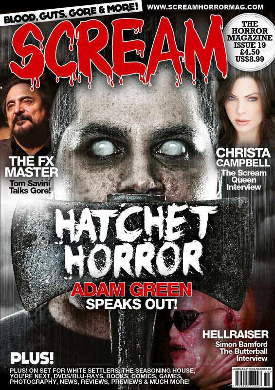
Joshua's Film Poster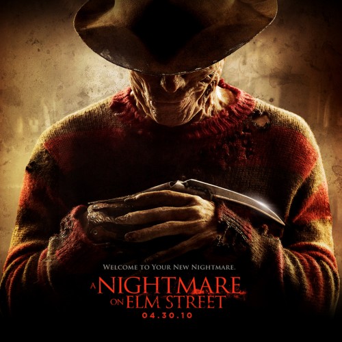
Film Title: A Nightmare on Elm Street Release Date: April 30th 2010 Director: Samuel Bayer Remake: This film is a remake of the original A Nightmare on Elm Street released in 1984.
Synopsis: This film is about a school worker, Fred “Freddy” Krueger who used to sexually assault school children in a preschool. He is then charged with this assault but he escapes and the parents of the abused school children then hunt him down into a boiler room where they set it alight, burning him alive. Freddy then comes back to kill all of the children (now in their late teens) from the preschool. Production: Platinum Dunes Financing Company: Warner Bros Principle Cast: Jackie Earle Haley as Freddy Kruger, Kyle Ganner as Quentin Smith, Rooney Mara as Nancy Holbrook, Katie Cassidy as Kris Fowles, Thomas Dekker as Jesse Braun and Kellan Lutz as Dean Russell. Camera The camera shot is a medium close up. It allows us to see from just above the stomach and upwards. Also allows for viewers to see Freddy’s burns on his face and hands. Typography Typography The font used in the poster for the title of the movie is a very plain and simplistic font. It is also in the colour red which matches the characters predominantly red sweater. Red is usually a colour/theme associated with horror films because it is has a strong link with blood, being as the subgenre of this movie is ‘Slasher’, there is a lot of blood. Mis-en-scene Lighting - Very dark photo with a fade brown colour around the antagonist. NVC – The character has their arms crossed with the bladed glove being shown slightly from one finger. Looking down and has a straight face. Setting- Looks very old and menacing. Costume- you can see that the character has burnt clothes on with several rips in his accustomed striped red sweater. Also has a hat which disallows you to see his eyes. Props- The infamous bladed glove which is the characters choice of weapon which he uses to kill his victims is shown. Colour/Mood There is a lot of dark colours used in this poster. This helps to resemble the darkness of the character and the darkness of his past. This connotes themes of horror movies which are supposed to be scary, dark and mysterious. Tagline The tagline used is “Welcome to Your New Nightmare”. This could be a play on words because the movie title is called “A Nightmare on Elm Street”. Joshua's Magazine
Mis-en-scene
Lighting – The lighting is greyish in this magazine, grey connotes doom and lifelessness NVC – The main character on the magazine has cloudy eyes with no pupils. Seems to be some sort of demon. He is looking right into the camera which is quite frightful. Setting – There seems to be clouds and rain in the background filling the space. Quite common in horror movies it is dark with bad weather never really sunny. Costume/Props – cloudy grey contacts + a hatchet which is covering the main characters mouth. Camera The shot of the main character featured on the horror magazine front cover is in an extreme close up shot. You can only see from his neck and upwards. Colour The colours of this magazine are black/greyish, white and red. These seem to be the main theme/colours of most horror magazines/posters. Mood & Styling The mood and styling of this magazine all connote the horror theme. Through the use of the greyish fade and colouring in the background it helps make it more effective. Typography The title of the horror magazine is in red, but the font is a droopy, bloody font, which represents blood. This blood themed font is also supported by the main cover line “Hatchet Horror”, and the main character behind the text with hatchet near to his mouth. Selling Line “Blood, Cuts, Gore & More”. This simple selling line helps the user to know a little bit of the content. It is also easy to remember. Javan's Magazine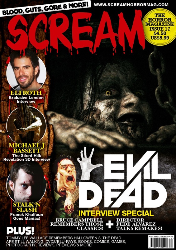
Film Title: Evil Dead.
Evil Dead was released back in 2013, 12 April 2013 (UK release) Director: Fede Alvarez. Evil Dead is a re-make of the first film in 1981. Synopsis: A group of friends are stay in a cabin nearby the woods. While staying at the cabin they discover a book. After reading the book of the dead they awaken an evil presence in the nearby forest. This leads to a disaster for the group as a lot of paranormal and demonic activity is enrolled upon the five. As the film progresses you get to see the illumination game played as one is left to fight for survival. Production/Financing Company: Production and financing was ruled out by between the three companies. TriStar Pictures, FilmDistric, Ghost House Pictures. Principle Cast: Jane Levy as Mia Shiloh Fernandez as David Lou Taylor Pucci as Eric Jessica Lucas as Olivia Elizabeth Blackmore as Natalie Rupert Degas voiced Demon Sub Genre: Supernatural/zombie. Mise-en-scene: Lighting: The lighting in the magazine cover is quite low, but enough to capture the face of the subject. Low lighting goes well support the dark theme of the film. NVC: The face of the subject looks joyful in its possessed state. However, the subject is filled with bruise, scars and cuts to connote a grimy theme for the magazine. Settings: The setting of this shoot is in the cabin taken from a scene in the film. The main subject in the shot looks trapped under floorboards. We can also see that the image is in a dark, dim environment. Costume: Stunning make-up is used for this magazine cover. The make-up delivers a supernatural sensation. Props: The props that are visible in this cover is the item Michael J Bassett is wielding on the magazine plus section. I also see a mannequin beside the evil dead title. Another prop I see in the magazine cover is the chain beside the main subject on the front cover. Camera: Framing and Shots: The camera shot used here is a close up (CU). Colour: The cover for the magazine is largely inky and dark. However, the cover lines and images host much more natural colour. The masthead is printed in a red typography which delivers the sinister thought of blood. Overall, this magazine cover is low with contrast which brings fourth the horror sensation of this front cover. Typography: Anchorage, font type & Specific Conventions: Starting with the masthead, the typography used looks like blood which automatically starts a correlation with the magazine theme. Standard and natural font is used for to present the website URL, the puff beside the website URL and the cover lines although the cover lines are slightly larger. The main cover line ‘Evil Dead’ is presented in a unique font, also larger than the other cover line fonts on the cover. The tagline at the top right-hand side of the page has black font with a white boarder. Mood & Styling: The mood that this front cover gives off is an uneasy sensation which is relevant to a magazine cover. The styling in terms of colour, font and camera shots used makes you makes the magazine look well-structured and well-developed. |
Magazine title: Scream.
Release date: Every 2 months. Genre: Horror (specialises in all sub-genres of horror). Mise-en-Scene Lighting: The lighting of the main image has dark lighting, but focuses on the detail of the girl who is possessed. The other images have a variation of different lighting. The three images on the left third of the magazine varies from light to dark. NVC: The non-verbal communication of the girl used in the main image of the magazine is her smiling directly to the audience. Her smile appears to be sinister. This is great in terms of horror because, if a character/main character in a film has a sinister smile, or something about them that stands out from the rest, they will be recognised by the audience. Setting: The setting of the magazine does not have a setting, just a black background from the main image. The black background suggests darkness which also supports the horror genre. Costume: No costume can be seen in the main image apart from special effects makeup. Props: No props can be seen on the magazine cover. Camera (framing and shots): The images shown on the left third are close ups apart from the middle image which appears to be a mid-shot image. The main image is a close up shot of the girl who is being possessed throughout the film – Evil Dead. Colour: The colour scheme of the magazine is black, white, red and yellow. The colour black suggests, the colour white suggests, the colour red suggests, the colour red suggests. Typography (anchorage, font type): The typography used for the masthead of the magazine stands out very much, is in a slanted Mood & styling: The entire layout of the magazine plays a part in making its audience recognise that it is a horror magazine. The images, typography, masthead, coverlines and colour scheme represent the horror genre. (Specific conventions) Masthead: The masthead is found at the top left section of the magazine. The masthead stands out the most compared to the other fonts used. The typography used is bold with dripping blood accents. The colour of the masthead is red. Relating to the horror genre, the colour red connotes blood. Coverlines: The coverlines are on the left and along the bottom of the magazine cover. The coverlines with the images above them, mention they are interviews and the coverlines along the bottom of the magazine are usual categories and exclusives they have inside. The typography used is quite basic but, the yellow and white colours used for the font make the coverlines stand out. This is sure to catch the audience’s attention. Main coverline: The main coverline of the magazine says ‘Evil Dead’ which is remake/reboot of the cult film franchise from the 80s. The Evil Dead logo is used to catch the target audience’s attention. Selling line: The selling line for the Scream magazine is ‘Blood, guts, gore & more!’ Images: The images used on the front cover are on the left and next to the main coverline. In total, there are 4 images (not including the main image. The first image on the left third of the magazine is of Eli Roth, the second image is a image from the Silent Hill: Revelation 3D film, and the third image is of Elijah Wood in the film Maniac directed by Franck Khalfoun. The fourth image next to the Evil Dead logo is from the original Evil Dead film. Main image: The main image is the largest image on the magazine cover. The image is of Jane Levy who plays Mia Allen in the remake/reboot of Evil Dead (March, 2013). Puff/Issue number/Price: The puff is found next to the masthead. It is a yellow circle with black typography. The puff does not have anything really interesting – it just states the issue number and price. The price of the magazine is £4.50 ($8.99). Dateline: The dateline is found in the same place at the barcode (bottom right). Barcode: The barcode has been placed on the bottom right of the magazine cover. Website link: The website link can be found at the very top of the magazine cover – www.screamhorrormag.com. Leonie's Film TrailerFilm title: Evil Dead
Release date: March 2013 Director: Fede Alvarez Production/financing company: Production –TriStar Pictures, FilmDistrict, Ghost House Pictures. Finance – TriStar Pictures. Principal cast: Jane Levy (as Mia Allen), Shiloh Fernandez (as David Allen), Lou Taylor Pucci (as Eric), Jessica Lucas (as Olivia), Elizabeth Blackmore (as Natalie). Sub-genre: Thriller horror. Film information: Remake, reboot, franchise and a loose continuation of the previous Evil Dead films. Synopsis: After being captured in the woods, an injured girl (Phoenix Connolly) is restrained in a basement with many people present. Upon revealing she is demonically possessed, her father (Jim McLarty) immolates and kills her. Sometime later, Mia (Jane Levy), her brother David (Shiloh Fernandez), his girlfriend Natalie (Elizabeth Blackmore), and their friends Eric (Lou Taylor Pucci) and Olivia (Jessica Lucas), arrive at an old, remote cabin in the woods where they plan to help Mia recover from her heroin addiction. David wants to reconcile with his friends and sister, as he left when his mother was committed to an asylum, forcing Mia to care for her. A stench leads them to the cellar, where they discover rotting animal corpses, a double-barrelled shotgun and a book titled Naturon Demonto. Ignoring warnings scrawled on the book's pages, Eric reads a passage aloud, summoning a demon. Believing that something is after her, Mia pleads to leave, but the group refuses, believing that she is suffering from withdrawal. Furious, she hijacks the group’s station wagon and leaves. A demonic version of Mia appears, causing her to crash the car. Returning to the cabin, she encounters demonically possessed trees, which hold her captive while she is possessed. Afterwards, David and Olivia find Mia and take her back to the cabin; visibly traumatized, Mia tells David that whatever attacked her in the woods is in the cabin with them, but he is unconvinced. When Mia kills David's dog, David walks in on her scalding herself in the shower, which Eric recognizes is prophesied in the book. David tries to drive her to a hospital, but flood waters block the road. After returning to the cabin, the now fully possessed Mia shoots David and tells the group that they will die before passing out. When Olivia tries to retrieve the gun, Mia overpowers her and vomits on her face. The group locks Mia in the cellar to contain her. The demon possesses Olivia, and Eric bludgeons her to death. While David tends to Eric's wounds, a crying Mia lures Natalie into the cellar, biting her hand and vomiting blood in her mouth before fleeing. Eric learns that the book prophesies that a demon called the Taker of Souls must consume five souls in order to unleash a being called the Abomination. Meanwhile, Natalie attempts to avoid consumption from the bite wound infection by severing her arm. David and Eric tend to Natalie's wounds, and then discuss their next move. Eric explains that Mia must be "purified" via burning, live burial, or dismemberment, which will end her possession and the demon's assault. Suddenly, a possessed Natalie attacks them. David shoots Natalie's other arm off with the shotgun, and the demon leaves her body as she bleeds out. David leaves an injured Eric while he plans to bury Mia alive. In the ensuing struggle, David is saved when Eric knocks Mia out, but not before she manages to stab him with a box cutter. As Eric dies from his wounds, he forgives David. David tranquilizes Mia and puts her in a shallow grave near the cabin. After she dies, he digs her up and uses an improvised defibrillator to revive her; the demon has been exorcised, and she is human again. Returning to the cabin to get the keys to his Jeep, David is mortally wounded by a now-possessed Eric. David locks Mia out of the cabin, engaging Eric by himself. David ignites a nearby gasoline can, engulfing the cabin in flames and killing them both. With their deaths, the prophecy is fulfilled. Blood rains from the sky as the Abomination rises from Hell and chases Mia. After a protracted fight that results in the loss of her hand, Mia manages to kill the Abomination with a chainsaw, and it sinks back into the ground. The blood rain stops and Mia walks into the forest. The Naturon Demonto lies on the ground nearby and slams shut on its own. During the credits, Professor Raymond Knowby recalls his past discovery of the Naturon Demonto. In a post-credits scene, an older Ash Williams (Bruce Campbell) appears in a dim spotlight and says "Groovy" before turning to the screen. Mise-en-Scene Lighting: Low and mid lighting throughout trailer. NVC: Lots of reaction shots – afraid, terrified, scared. Setting: In the woods, inside a cabin. Costume: Casual clothing, jeans, t-shirts, trainers. Props: Knives, the Evil Dead book (Naturon Demonto), plank of wood, chainsaw. Camera (framing and shots): Lots of close up shots throughout, wide angle shots, a few long shots to show a few things that happen in the film. Colour: Lots of dark colours used and lighting to emphasise the horror genre. Typography (anchorage and font type): The typography used throughout the trailer is quite basic and not engaging. Mood & styling: The non-digetic sound used throughout the trailer has suspense and sounds scary. The way the dialogue is executed by actress Jane Levy is perfect because it will scare the audience and will keep them interested. Also, the scenes shown throughout the trailer have self harm/torture, blood, possession, etc. so, this will influence the target audience to want to see the film. Sound: Suspense-like soundtrack (non-digetic). Locations: In the woods, inside a cabin. Narrative: Dialogue throughout film, mainly from the main character – Mia Allen (Jane Levy). Editing: Continuity editing, Quick cuts throughout, dialogue throughout, many reaction shots. Liz's Film TrailerTitle: ‘The Omen’
Release date: 1976 Director: Richard Donner Producer: Harvey Bernhard Principle cast: Gregory Peck, Lee Remick, David Warner, Harvey Spencer Stephens, Billie Whitelaw, Patrick Troughton, Martin Benson and Leo Mckern. Sub-genre: Psychological Film information: the film was distributed by 20th century fox and scored by jerry goldsmith. Even though the film was distributed by a major production company, 20th century fox, it made major losses from its starting budget to make the film the budget was $2.8 million but at the box office it only made $60,922,980. There was 3 film in the omen series and 2 tv film’s called the omen and Omen IV: the awakening. Synopsis: In Rome a man and wife have a baby that dies to stop his wife from being upset he adopts an orphan that mother had died at the same time as their baby. The mother is not told and she names their son Damien. Everything is fine until Damien turns 5 when things start to go wrong for example the nanny hangs herself at his birthday party and Damien grows an unusually close relationship with a viscous dog. The priest warns the father that their son might not be human due to his curious origins. Animals start to act on Damien’s thoughts whether this means attacking or fleeing. The parents try to locate the original priest that was there at Damien’s birth. Robert, Damien’s adopted father, realises that Damien is the antichrist and teaches himself how to kill an antichrist. While trying to wrestle Damien into the church a policeman see’s the commotion and shoots Robert in the effort to save Damien. Damien then attends to his parent’s funeral leaving an ambiguous ending where the audience want to know what happens next. Lighting: The lighting throughout the whole of the trailer is pretty dull and dark except the part where Damien’s nanny hangs herself at his birthday party. I think this was used to make us concentrate on certain parts of the trailer and to keep the audience interested through drastic changes in scenes. NVC: throughout the trailer the child Damien has an eerie stance that could be seen as almost threatening. Whereas his parent’s posture becomes gradually worse and more hunched. This follows along the connotation of timidness and the body making it look smaller whereas Damien’s back becomes straighter this shows that he is obviously the character with all of the control in these situations. Setting: the trailer is set in 3 main settings; the church, the manor house and in the car. All three of these places can be seen as pretty claustrophobic. Even though the manor house and church are large inside they have the connotation of oppression and this can be used as a build up of tension. Costume: the costumes are very smart and are not clothes that we would see day to day especially as Damien is only a small boy and he is wearing suits. This however is used to show their wealth and social status. This could be seen as a political statement as at the time that the film was released there was a clear sense of financial depression. Props: crucifixes and crosses are a major prop in this trailer and sets the scene for the psychological horror film as it already introduces the aspect of religion which takes a major role in the subgenre of psychological horror. Framing/shots & movement: throughout the trailer there are a lot of close ups and reaction shots of the main characters especially Damien. This makes him look more menacing however it has the opposite result with the other characters as it makes them seem more and more vulnerable and this increases throughout the trailer. Typography: captions: There aren’t any major captions within the trailer only the names of the actors starring in the film and the title itself. Voiceover: There is a constant voiceover throughout the trailer which narrates the story of the omen and coincides with the clips that are being shown within the montage. Towards the end of the trailer the voice over repeatedly asks rhetorical questions this is often used in speech writing as it is a persuasive technique in this case it is used to persuade the audience to watch the omen. Score/incidental music: at the beginning of the trailer there is smooth and sweet slow music in a major key with the voice over talking about before Damien arrived in their lives. This suddenly changes when Damien’s name is mentioned with eerie music in a minor key and church chimes that seem to have had their sound diminished and made to also be flat and in the minor key. The score then changes to a mix of both with the delicate notes but with a sadder and more urgent tonality. Towards the end of the trailer a new section of the score is introduced with a cello. The cello is known for creating a sense of mystery within music. The score progressively to the end crescendo’s and diminuendo’s this throws off the audience and builds suspense in a major way. Narrative: There is a clear relationship within the film between the characters and religion e.g. catholic. This is a clear convention that is used within psychology horror films. Then there is the mental aspect where Damien and the Dogs have a mental connection when he can get them to do whatever he wants them to do. Editing: The editing is pretty simple in the ways that the trailer is shown it uses montage editing with a slow pace this shows more of the film but still manages to keep the audience’s attention by showing them the main horror parts e.g. the stock situations. Title: Scream
Information: The magazine is published bi-monthly and is only published in the United Kingdom. It involves information about up and coming films, interviews and film festival reports. It also has its own Facebook and twitter and you can download and print off the magazine if you can’t find it anywhere else. Lighting: The lighting is as you would expect in any context that involves horror, the background is dark and eerie and the faces are illuminated with a pale white glow creating them to look scarier/ more horrific then they would have normally. Props: There is really only one prop on this cover page and that is an axe/ a hatchet. I think that this was mainly used to link in with the main cover line than anything else. It can also be used for its dramatic effect, it’s a sharp instrument that instantly makes it fearful and makes the magazine stand out. Camera: All of the shots on the front page of this magazine are close ups this makes the cover seem more intimate and that you are actually part of it as you can see the characters faces up close therefore you can see their expressions. Colour: The three typical colours for horror are used again on this front cover of the magazine these are white, red and black. The main colour that is used is black which has the connotation of death with less of the 2 other colours that are symbolic for innocence (white) and blood/ anger/ passion (red). Masthead: The masthead is very short and clearly fits in with the genre that it promotes its also in red which connotes blood and this also fits into the horror genre. Coverlines: There are only 2 other cover lines apart from the main cover line this is very unusual as magazines will usually have 4/5 or more. However this could be because they don’t want to distract the audience from their main focus/ main cover line. The cover lines are also very basic and don’t tell the audience a lot about what the article is about. Joshua's Film Trailer
Javan's Film Poster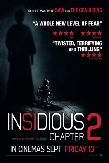
Insidious: Chapter 2 – Sept. 13 2013
Directed by James Wan Insidious: Chapter 2 is a sequel to its previous episode. Synopsis: Insidious 2 is a continuation from the last chapter. The main character Josh Lambert used to experience hauntings in his old home. We see in the new chapter that Josh Lambert has grown into a man with responsibilities, two children and a wife. His son Dalton begins to experience similar hauntings in the home. The family experiences the paranormal activities – Josh believes the haunting too but tries to keep it to himself for the rest of the family’s benefit. Josh knows the demon controlling the hauntings since a young age. He tries to use this to his advantages as he tries to convince the demon to stop the paranormal activities but ends up taking matters into his own hands. Production and financing was funded by FilmDistrict and Stage 6 Films The 2013 film consisted cast members: Patrick Wilson – Josh Lambert Rose Byrne – Renai Lambert Ty Simpkins – Dalton Lambert Lin Shaye – Elise Rainer Barbara Hershey – Lorraine Lambert Steve Coulter – Carl Sub Genre: Supernatural Mise-en-scene: Lighting: The lighting used is mainly focused on the child in the centre of the film poster. It looks as if it is this spotlight from the ceiling is angled on purpose to create the shape of the baby but also at the same time keep the identity of the child hidden. Already it has a mysterious twist to it. The little light used forms a dark characteristic to the film poster. What really gives this poster the horror-feel is the noticeable shadow on the wall. Again, little light is used to form the shadow. In fact, they used just enough light to form a shape of someone anonymous standing beside the child with a glow of light around the body shape. Those are the only two small lit areas on this film poster which promotes a dark and daunting poster altogether. NVC:The poster theme is dominantly black and unlit. The identity of the child is hidden due to a dark face which gives the idea that the innocent looking child is a part of some hair-raising activities. What’s more is that the shadow stamped on the wall stems back to the baby. Even though both of the subject’s identities are hidden you receive the feeling that the poster has strong paranormal language. Settings:The setting for this film poster is well covered in an unilluminated colour. We know that the poster was shot in an enclosed environment, reason for wall and wooden floor. This helps communicate ideas for where this film poster maybe set. Costume: We can see that the shadow stemmed from the child is wearing a dress ironically while the child isn’t wearing a dress. Props:The only prop visible in this film poster is a baby walker. Camera: Framing & Shots:The photo used in the film poster is captured in a wide shot (WS). Colour:The colour used dominantly in this film poster is a black. The inky colour helps form a dark and paranormal language. The colour of the font breaks down the darkness in the poster. White is used as it goes well against black and another good choice of colour for the font is red as it gives ads that special sinister language to the film poster. Typography: Anchorage, font type: A slim but large font is used and centred for the main title ‘Insidious: Chapter 2’. The date line is also fairly large almost matching up to the main title line. Other than that, we have quotes and ratings. ‘A whole new level of fear’ and ‘twisted, terrifying and thrilling’ communicates a good level of horror in the film is reached with three 4 stars. The quotes are noticeably enrolled in a different font which is bold and white. This perfect as the quotes pierce the readers eyes. A tagline at the top of the poster is printed in a smaller typography compared to the rest of the posters on the film posters. However, the tagline increases the sizes of ‘saw’ and ‘the conjuring’ as these are the two most important words the sentence. Mood & Styling: Insidious’ 2 film poster gives of a grim mood as all aspects of the poster is quite dark including the lighting, font colour, colour of the background etc. This is successful because you want the viewers to get the correct feel of the paranormal film. The styling of the poster makes encourages me to want to see the film simply because quotes convince me. Specific Conventions: Under the title, you can see the company credits. You can see FilmDistrict’s and Stage 6 Films’ logo. Beside the logo you can also see the film rating. A popular release date for horror films is Friday 13th. Friday 13th is printed in red. This gives the font a more sinister appeal. The quotes are bold due to thickness of typography and colour. Javan's Film TrailerFilm Title: The Conjuring
Release date: 2nd August 2013 (UK) Director: James Wan Film Info: The Conjuring is the origin and first. Synopsis: A family which lives in a paranormal home filled with strange activities decides to find assistance from Ed and Lorraine Warren. Ed and Lorraine try to help the family terrorised by the demonic presence within their farm home. Production/Financing Company: By New Line Cinema, Safran Company, The Evergreen Media Group. Principle Cast: Vera Farmiga as Lorraine Warren Patrick Wilson as Ed Warren Lili Taylor as Carolyn Perron Ron Livingston as Roger Perron Shanley Caswell as Andrea Sub-Genre: Supernatural and psychological. Mise-en-scene: Lighting: In the trailer we see that the film is fairly lit well but we do see a dullness contrast and brightness. However, there are parts in the trailer were we see complete darkness like when the mother was in the basement and the light cuts off. NVC: We can see that throughout the trailer the dark presence has a uneasy effect on most of the cast members who starred in the 2013 film. Setting: The trailer shows the film is dominantly set in the farmhouse. Although we do see drama happening throughtout areas of the house such as the living room, the girl’s bedrooms, the stairwell, the basement etc. Costume: We see the warrens normally dressed in formal, while the rest of the family is dressed in everyday clothing. Props: You do see a blindfold as a prop, we also see other props such as the pictures on the walls. Camera: Framing, Shots & Movement: We see: MCU (Medium close up) MS (Mid shot) CU (Close up) – Blindfold scene CA (Cutaway shot) Reaction Shot Follow Colour: The colours we see in the trailer are not vibrant but toned down to where the colours are slightly dull. This matches the horror theme. Mood & Styling: James Wan was successful in forming on uneasy mood in the trailer. The trailer itself hand me on the edge of my seat. The styling I believe places the audience in a taunted mind frame. Sound: The sounds I can hear in this short clip are: Score/Incidental Music Dialogue Diegetic Non-Diegetic Sound effects Rendering Locations The Conjuring was shot in Wilmington, North Carolina, United States Narrative: The Perron family experiences haunting and suspicious activities around their family farmhouse. When the haunting continues, Carolyn requests two investigates, Ed and Lorraine Warren to investigate the paranormal situation. What Ed and Lorraine discover is much more than the Perron Family bargained for. They discover that that the whole area is steeped in a demonic haunting and no matter where they go the demonic force follows. It requires the Warrens to use all of their strength to get rid of the satanic force when it poses a threat to everyone. Editing: We see quick cuts, cuts, establishing shot, eye-line match, and straight cut |
