In What Ways Does Your Media Production Use, Develope
or Challenge Forms & Conventions of Real Media Products?
|
The trailer that my group made, 'The Invite' uses a wide variety of conventions and forms that can be seen in real media products. Our magazine and poster also follow conventions and forms that we have seen in other magazines and posters that we looked at during out research. After researching horror posters and magazine front covers we began to piece together the similarities between them and the conventions. using this information we could then start working on making and developing our idea's toward our final product.
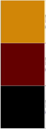
In horror magazines the colour scheme seem to be quite diverse however all the colours used are usually bold and clashing or opposites. We can see this in the 'fangoria' magazine with its main colour scheme of 'Red, Black and Yellow' these juxtaposing colours make the front cover stand out and attracts and audience. the yellow that is used is especially shocking against the black and red dropping which ironically links to the genre of horror as the point of horror is to shock and make its audience uneasy. As a group we particularly like the colour scheme and used it in both the magazine front cover and film poster so that there was a memorable link for our audience. As a group we looked at other horror magazine front covers and saw that in a lot of them for the main article have a singular protagonist or antagonist as a focal point we used this idea and had the protagonist in a dark lighting with a singular light shining from below. this adds depth to the magazine front cover and creates an eerie atmosphere. This develops the idea's used in the fangoria magazine front cover where there is also a singular focal point but in this case it is the antagonist and the lighting is very basic which makes it look like it was just cut and pasted ont0 the background. Looking at magazines in general especially music and film magazines they tend to Promote that they have a free magazine inside that is linked to their main article so we decided to use this idea as it makes the magazine more realistic. We also saw that in the horror magazines they tend to have other images spotted around the front cover that relates to the articles in the magazine we also used this. We used particularly violent/ gruesome images because from what we have seen the more gruesome a film or image is the more attractive it is to our target audience. |

|


|
The poster: |
