By Leonie Bent
For this part of the pre-development stage, we will be creating the drafts for our horror magazine and film poster. This section will consist of 4 hand drawn drafts each for the magazine and film poster, and then 4 photoshop mock ups each for the magazine and film poster. In total that is 8 hand drawn drafts, and 8 photoshop mock ups. The hand drawn drafts will give us an idea on how our magazine and poster will look; and the photoshop mock ups will be the drafts with further development. Doing photoshop mock ups will make it easier for us to map out the conventions when it comes to creating our outcomes, so we can accomplish the professional look of the existing magazines and posters.
Here are 5 horror magazines we found online. We chose 5 different magazines so we have a variety of magazines to get our ideas from. We chose these magazines for specific conventions; the masthead, the colour scheme, the layout, the images, etc. The sections we like in these magazines will be put into our magazine mock ups. The magazines we decided to look at were; HorrorHound, Diabolique, Shock Horror, Scream and Fangoria.
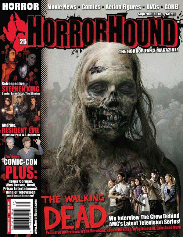
The main image is interesting with the detailing of the decaying zombie. The red, black and white colour scheme completes the magazine cover. We also like the selling line of the magazine at the top of the cover.
|

The masthead of the magazine was quite interesting because, a horror magazine would usually use a creepy looking font as the masthead. Also, the masthead is at an angle with cartoon images coming out of it. This is a nice touch to the magazine.
|
The puff in the bottom left hand corner adds a nice touch to the overall outcome of the magazine cover.
|

The film strip with the extra images adds more content to the magazine cover. We decided that we would like to add this to our magazine because, more images instead of using a main image will attract more people.
|

We thought the white background and white main image was quite different, because most magazines use black backgrounds. We thought this was eye-catching and unique.
|
Below are the 4 drafts hand drawn by Leonie for the horror magazine. The text around the hand drawn drafts explains what has been included in the magazine drafts.

Below are the four drafts created on photoshop by Leonie, developed from the four hand drawn drafts.

|
This is the first photoshop draft developed from the first hand drawn draft. A few conventions have been rearranged for a better outcome. The masthead of the first magazine draft has been placed at the top of the magazine (below the selling line) in the colour yellow. The typography used for the masthead looks like a scratchy font in capitals. The main image is a close up shot of the antagonist/protagonist/character. Having a close up shot will allow any detailing to be shown, i.e. scars, blood, scabs, etc. along with facial expressions. Additional images have been included in his magazine draft. The images have been inserted into a film strip like the existing magazines we previously looked at. We thought this added extra content to the magazine cover. Magazines do not usually add extra images into a film strip, so this is quite unique. The main coverline of the magazine is the name of our film 'The Invite' with the strapline of the film below. The font used for the main coverline is in a bold creepy font, in the colour yellow. When the final poster has been completed, the film title will be used as the main coverline for this magazine. The coverlines of the magazine will be on the left hand side of the front cover. This seems like the best placement because, there are so many conventions going on. The puff has been placed in the bottom left corner of the magazine. This may be rearranged if we decide to use this magazine layout. The selling line of the magazine has not yet been decided, but it will be at the very top of the front cover, above the masthead. Social network logos are not usually included as a convention on a magazine cover, but we decided to include this convention because, most magazines are interactive now a days. The barcode, dateline, cost and website link have all been placed in the same section - the bottom right corner. |
|
This is the second photoshop draft developed from the second hand drawn draft. A few conventions have been rearranged for a better outcome. The typography used for the masthead looks scary and distorted in a dark red colour. The masthead has been placed at the top of the magazine cover, and is very noticeable due to the large size, the colour and the font used. The main coverline has been placed at the bottom middle of the front cover with the strapline of the film below it. The colour of the main coverline is the same colour as the masthead, and is slightly smaller than the masthead. The typography used will be the same font used for the film title on the finished film poster. The main image is a long shot of the antagonist who wears a mask, and is holding their weapon. A long shot image allows us to see the costume of the character, what they look like from head to toe, and their body language. The coverlines of the magazine have been placed on the left hand side. This allows there to be enough space for the main image. The puff has been placed next to the image image. If we decide to use this layout, the puff will have to be rearranged because, the puff may cover the person in the main image. The selling line has been placed at the very top of the magazine (above the masthead and the issue number). Having the selling line at the top of the magazine allows there to be more room for the other conventions. The social networking logos have been placed on the right hand side of the magazine cover. The logos we decided to use are; YouTube, Twitter, Facebook and Tumblr. The barcode, cost and dateline have all been placed in the left hand corner of the magazine. Most magazines place the barcode in the bottom corners so, they have more space for the other conventions. The cost and dateline are usually placed at the top, but we thought having it at the bottom was a better idea. However, we may move the cost and dateline conventions around if there is not enough space for the coverlines and main coverline with the film's strapline/tagline. The website link is on the right hand side, below the social network logos. It will be placed at 180 degrees. The issue number has been placed above the masthead. This allows the audience to see what the issue number is easily. |

|

|
This is the third photoshop draft developed from the third hand drawn draft. A few conventions have been rearranged for a better outcome. The masthead has been placed at the top of the magazine cover. The typography used for the masthead looks as if it is melting. The letters are in line with each other, and not distorted in any way. Also, part of the masthead has been covered by the main image, making it difficult for the audience to recognise if the magazine is not popular. The colour of the masthead is bright purple, resembling the appearance of the main coverline. The main coverline has been placed at the bottom of the magazine cover. The typography used looks distorted. It looks scratchy. The font used for the main coverline should be the same as the title of the film poster, so our target audience will recognise the title of the film. The main image is a long shot of the main antagonist of the film. He will be holding his murder weapon, just like the character in the main image of this draft. Also, his head is covering the masthead slightly. When creating the final outcome, this probably will not be included because, the audience will not be able to recognise the name of the magazine. The coverlines of this magazine draft has been placed on the left-hand side. The coverlines will be in the colour yellow (the colour scheme is purple and yellow). There will be at least 3 coverlines, due to the minimal space. The puff has been placed on the right-hand side of the magazine cover. The puff also includes an image of the magazine/film poster (this has not yet been decided). The other magazine drafts do not include this. Unlike the other magazine drafts, the selling line has been placed at the bottom of the magazine. This probably isn't the best place to put the selling line, as it is not too noticeable compared to the other conventions on the magazine. The barcode, and cost of the magazine have both been placed at the bottom left-hand corner. This is noticeable enough for the audience, and are both in a suitable face. The dateline and issue number are in the right side of the magazine - below the masthead. This will be noticeable due to the placement of the other conventions. Having these 2 conventions placed below the masthead will make our audience find out what issue the magazine is and when the magazine is usually released. The website link is in the bottom right-hand side of the magazine - above the selling line. |
|
This is the last photoshop draft developed from the last hand drawn draft. A few conventions have been rearranged for a better outcome. The masthead has been placed at the top of the magazine cover. The typography used for the masthead looks distorted, and as if it has been stamped onto the page. The colour scheme used for this magazine draft is red, and yellow. The main coverline of the magazine cover is of the film title, which will be the same font from the film poster. It has been placed inside the film strip at the bottom of the magazine. Below the film title will be the strapline of the film. Additional images have been placed on both sides of the main coverline. The additional images are likely to be cuts from the upcoming film trailer. The main image is practically the same as the image from the previous magazine draft. it is a close up shot of the main antagonist holding his murder weapon towards the audience. There will be a lot of coverlines on this film magazine. If there is not a lot of space due to the other conventions, there will not be as many coverlines. The placement of the coverlines are on the left and right sides of the magazine. The puff of the magazine will be in a circle shape, above the issue number, on the right-hand side. We thought the placement of the puff tied the whole magazine together. The selling line has been placed behind the main image of the magazine, below the masthead. It has been placed in a slanted position, matching the masthead. The barcode, dateline and cost of the magazine has been placed in the bottom left-hand corner. The website link has been placed in the bottom right-hand corner of the magazine cover. The issue number of the magazine will be placed in between the puff and the coverlines on the right-hand side. This convention will probably be relocated because, it may look buried into the other magazine conventions. |

|
As well as looking for inspiration for the horror magazine, we had to do the same for the film poster. We chose 5 films with serial killers in them; Halloween, The Purge, Friday the 13th, Scream 4 and The Texas Chainsaw Massacre 3D. We chose these particular film posters because our film concept has a serial killer as the antagonist.

We really like the main image. The image of Michael Myers looks fiery, which also matches the film title.
|

The main image supports the film. This is antagonist of the film, who wears a mask. Serial killers usually wear masks in horror films to hide their identity. We really liked this idea.
|

The dark lighting in this Friday the 13th poster will lead the audience to believe this is a horror film (along with the main image). When it is hard to see what the antagonist looks like, it gives us a sense of mystery.
|

We like the bold font used for the masthead, along with the images below the antagonist. These are the main characters in the film.
|

We thought having the main antagonist holding the main prop and not showing their face was a good idea. The poster is not giving away too much information about the antagonist, although we know that he is a male serial killer. The low lighting also convinces us that the film is of the horror genre.
|
Below are the 4 drafts hand drawn by Leonie for the film poster. The text around the hand drawn drafts explains what has been included in the film poster drafts.
Below are the four drafts created on photoshop developed from the four hand drawn drafts.

This is the second photoshop draft developed from the second hand drawn draft. A few conventions have been rearranged for a better outcome. The typography used for the film title is a cursive, italic type font. The colour used for the font is a deep yellow colour (the same as the previous film poster draft). The typography used is deceiving, but the main image makes up for the horror genre. The film title has been placed at the top of the poster, above the main image. The tagline of the film has been placed below the film title, directly above the main image in a font that looks hand written; as if a primary school student has written it. This gives the idea that the main antagonist is mentally challenged. The colour of the tagline is white to match the black, white and yellow colour scheme. The main image used for this film poster is similar to the hand drawn draft. It is of a victim having her neck cut by the antagonist of the film. The main image takes up most of the space of the poster draft, making there barely be any room for the other conventions. If we decide to use this layout for our final film poster, a few conventions will have to be moved around. The release date still needs to be decided so, it says 'Coming Soon' for now. It has been placed in between the film credits and the rating conventions. The font used for the release date is the same as the tagline in yellow. The film credits have been placed at the very top of the film poster. This is a unusual placement as the existing film posters we looked at have not done this. The rating of the film poster has 5 yellow stars with the quote from a magazine (our horror magazine). The font used for the rating in capitals but small. It looks squashed between the other conventions. If we decide to use this layout for our final poster, this will be one of the conventions to be rearranged. The age certificate of this film is an 18. The logo for the age certificate has been placed in the bottom right corner. The production company logo is in the bottom left corner. |
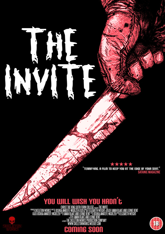
This is the first photoshop draft developed from the first hand drawn draft. A few conventions have been rearranged for a better outcome. The title of the film is 'The Invite'. The typography used for the film title looks creepy. This will convince the audience that the film is of the horror genre. The colour used for the film title is a deep yellow colour to compliment the red, black and white colour scheme. Also, a drop shadow has been added so, the title stands out more. The tagline of our film is 'You Will Wish You Hadn't'. The tagline has been placed below the film title in a basic but bold font (in capitals) in the colour white. The main image of a film poster should capture the audience's attention. The main image of this film poster is of the mask/face of the main antagonist of the film, with blood splattered behind him, on the black background. The release date let's the audience know when the film will be released. The release date has been set to 'Coming Soon' because, we have not yet decided a date. The release date has been placed below the film credits, at the bottom of the poster. The film credits show who was involved in creating the film, i.e. the producer, the writer, the director, etc. The credits have been placed at the bottom of the film poster. Ratings/quotes from reviews of the film are included in film posters to give a bit of insight on what the film is like, not what it is about. Magazines or film critics give their opinion about the film and will rate the film out of 5 (sometimes out of 10). For this film poster, the rating has been placed above the film title in a white font. The source of the font is the colour yellow (the same colour as the film title). The age certificate of our film is an 18, suggesting that the film has flashing lights, mature scenes, violence, etc. The production company for this film is, Skeleton Works (our production company). The age certificate and production company logo have both been placed at the bottom left and right sides of the poster. 
|
|
This is the third photoshop draft developed from the third hand drawn draft. A few conventions have been rearranged for a better outcome. The typography used for this film title is distorted, scary and in capitals. The colour used for the film title is in white. The pastel red would overwhelm the film poster, so we decided to use the colour white, which is part of the black and pastel red colour scheme. The placement of the film title is at the top of the film poster. The tagline of the film has been placed at the bottom of the film poster above the film credits. The font used for the tagline is bold and in capitals in pastel red. The main image is of someone holding a sharp knife covered in blood. Preferably the main antagonist with the main prop. The release date of the film has not been set, so we decided to set it as 'Coming Soon'. The font used for the release date is the same font and colour as the tagline. It has been placed at the very bottom of the film poster, below the film credits convention. The film credits for the film poster has been placed at the very bottom of the poster, in between the tagline and release date. The rating of the film has been placed on the lower right-hand side of the poster. This placement completes the whole poster. There are 5 pastel red stars indicating that the film has a 5 star rating, and the quote from the review Satanic Magazine has given (the magazine we created). The font used for the film rating is the same as the tagline and the release date. The age certificate is an 18, and the production company is Skeleton Works. Both logos have been placed at the very bottom of the film poster on the left and right hand sides. |
|
This is the last photoshop draft developed from the last hand drawn draft. A few conventions have been rearranged for a better outcome. The typography used for the film title looks like the font used for a typewriter, with a stamp-like effect. It has been placed at the bottom of the poster above the tagline. The colour used for the film title is in dark green. The colour scheme used for this film poster draft is black, white and green. The tagline for the film is 'You Will Wish You Hadn't'. It has been placed below the film title (above the film credits) in a basic font, in capitals. The main image used for this film poster draft, is of a woman screaming. This would suggest that she is screaming at the main antagonist of the film. The colour of the main image is in black and white to match the colour scheme. It has been placed in the middle of the poster to create space for the other conventions. The release date of the film has yet to be set, so we decided to leave it as 'Coming Soon' for now. It has been placed at the very bottom of the poster; below the film credits, in the same font used for the tagline in the colour white. The film credits have been placed at the bottom of the poster, in between the tagline and the release date. We decided to change the colour of the film credits from white to dark green because, too much black and white was going on throughout the poster. Unlike the previous film poster draft developments, 2 review quotes have been added instead of 1. Having more than one rating for the film will encourage people to see the film. The 5 stars for each rating is in green, and the sources where the quotes from the reviews are in green too (Scream and Stanic Magazine). The quotes are in white. The font used for the ratings are the same font as the tagline and the release date. The age certificate for the film 'The Invite', is an 18, and the production company for this film is Skeleton Works (our production company). The logos for these 2 conventions are at the bottom left and right hand sides of the film poster draft. |

|
