HOW EFFECTIVE IS THE COMBINATION OF YOUR MAIN
PRODUCT AND ANCILLARY TEXTS?
By Leonie Bent
(CLICK ON IMAGES TO VIEW AS A LARGER SIZE)
Introduction
EXAMPLES

|
|
EXAMPLES OF SYNERGY & CROSS-MEDIA CONVERGENCE
(REAL MEDIA TEXTS)

|
SAW FILM POSTERS FROM 1 TO 7
|
An example of a famous horror franchise that uses CMC and synergy would be the Saw franchise. The franchise consists of seven films in conjunction with merchandise. It is distributed by Lions Gate Entertainment and is produced by Twisted Pictures. All together, the films have grossed over $873 million at the box office worldwide. Since 2010, the Saw franchise has been featured in the Guinness World Records as the "Most Successful Horror Movie Series". The first Saw film was a short nine minute clip with a low budget of $3000. Due to the very low budget, one of the creators of the Saw franchise, Leigh Whannell stars in the short film. The nine minute short film received amazing reviews, which allowed the creators; James Wan and Leigh Whannell to create a 102 minute feature film with a $1.2 million budget. At the box office of the first film, it received $103.9 million. Since the first feature film was such a success, Wan and Whannell decided to create more Saw films to play as sequels and prequels in the franchise. |
|
|
|
|
|
|
|
|
|
FROM LEFT TO RIGHT: SAW TRAILERS 1 TO 7

BILLBOARD WITH SAW 3D POSTER (SAW 7)
|
It has now been over ten years since the first feature film of Saw. Six more films have been added to the franchise along with merchandise, video games, DVD's and theme park rides. The continuity shown throughout all their products (i.e. the film posters, trailers, ride, DVD, etc.) makes Saw easy to market and brand. The colour scheme, film logo and images make it easy for the audience to recognise the Saw franchise whether they choose to market the film using clothing, posters or mugs.
All of the Saw posters have been consistent in appearance; they all have a white background, white, black and grey colour scheme, the Saw film logo and grunge-like typography and images. Since the Saw franchise had the budget to spend a lot of money on advertising, they were able to use huge billboards to market the release of their films - i.e. Saw 3D. The continuity of the Saw franchise products still stands with the Saw 3D poster as it uses the same white background, same colour scheme (this time including red as it is the final Saw film), same typography and the same type of grunge-like image where the torture weapon is being shown. Having such popular marketing strategies such as the billboard helped the film to earn over $135 million at the box office from a budget of only $17 million. |
BLU-RAY AND LIMITED EDITION BOX SET

SAW: THE COMPLETE BOX SET & BLU-RAY DVD
|
Here is another example of the continuity shown throughout the different media platforms. On the Blu-Ray cover of the Saw 3D film, there is very similar cover art compared to the poster on the billboard we previously looked at. The bear trap torture weapon is featured on both the Blu-Ray cover and the billboard poster along with the famous 'Saw' logo. The complete Saw box set (DVD) is a bit different in appearance but still shows continuity compared to the other Saw products. The typography used, the grunge-like theme and the film's title still resembles the other media products. Also, there is continuity shown with the the black, white and red colour scheme with the complete box set, the blu-ray DVD and the Saw 3D billboard poster. Having an unrated limited edition box set with all the Saw films will ensure that the franchise will earn more money from fans of the Saw franchise. |
CONSOLE GAMES
|
There are not many video games based on existing films (it's usually video games adapted into feature films), so Saw having it's own video game shows how marketable the Saw franchise is and how many different media platforms it can be on. The first game shows a close up image of the iconic ventriloquist puppet, Billy, who stars in all of the Saw films. The film title is in the middle of the cover art. The colour scheme used for this game is red and black; which is somewhat similar to the colour scheme used for the posters. The second game, Saw II: Flesh & Blood shows more similarities to the film posters. The cover art has been placed on a white background, the film's title is in black and the overall cover art has a grunge-like texture on it. This game was released on October 19th, 2010 on PlayStation 3 and XBOX 360; 10 days before the release of Saw 3D (Saw 7). |

SAW & SAW II: FLESH & BLOOD ON XBOX 360 & PS3
|
AMUSEMENT PARK RIDE

SAW: THE RIDE AT THORPE PARK
|
Finally, Saw: The Ride at the theme park in the UK, Thorpe Park. In addition to Saw: The Ride, Saw: Alive which is a live-action horror maze for visitors to experience was built in conjunction with the roller coaster ride. The continuity of the franchise still exists with the roller coaster and the maze because, the same typography, film title, images and colour scheme are still being included. |
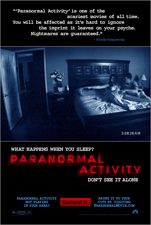
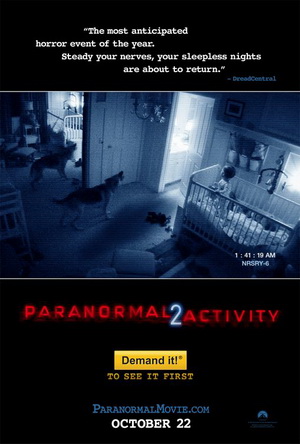
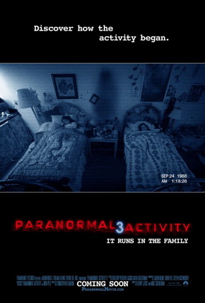
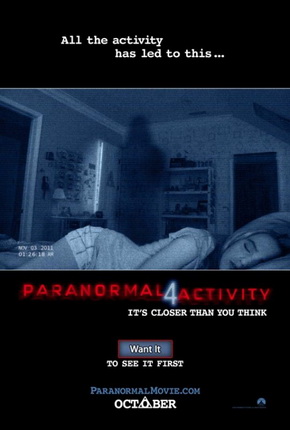
Our second example of a famous horror franchise that uses CMC and synergy is the Paranormal Activity franchise. The franchise consists of five films, including the short lived spin off film (which was supposed to be a new film series), Paranormal Activity: The Marked Ones. On March 13th, 2015 a sixth film for the franchise is planned to be released, Paranormal Acitivty: The Ghost Dimension. The Paranormal Activity films are produced by Blumhouse Productions and is distributed by Paramount Pictures. The films were created by various writers; Oren Peli (PA1), Michael R. Perry (PA2), Christopher B. Landon (PA2, 3, 4 and PA: The Marked Ones), Tom Pabst (PA2) and Jason Pagan and Andrew Stark (PA: The Ghost Dimension ). Various directors also contributed to the making of the Paranormal Activity films; Oren Peli (PA1), Kip Williams (PA2), Henry Joost and Ariel Schulman (who is the brother of Nev Schulman from Catfish: The TV Show (PA3 and 4)), Christopher B. Landon (PA: The Marked Ones) and Gregory Plotkin (PA: The Ghost Dimension). So far, all together, the PA films have had a budget of over $18 million, and have earned over $811 million. The first PA film was nominated for "best first feature" in the Independent Spirit Awards in 2009.
|
|
|
|
(FROM LEFT TO RIGHT) PARANORMAL ACTIVITY FILM POSTERS 1 TO 4
|
|
|
|
|
(FROM LEFT TO RIGHT) PARANORMAL ACTIVITY FILM TRAILERS 1 TO 4
PARANORMAL ACTIVITY AUDIENCE REACTION
|
|
SPIN OFF - THE MARKED ONES
|
|
PARODIES - A HAUNTED HOUSE
|
|
|
REMAKES
|
DIGITAL COMICS
|
|
|
TRAILER AND POSTER
|
|

|
OUR TRAILER AND POSTER
|
|

|
|
|
TRAILER AND MAGAZINE
|
|
|
OUR TRAILER AND MAGAZINE
|
|
|
|
|
|
TRAILER AND WEBSITE
|
|
|
POSTER AND MAGAZINE
|
|
|
POSTER AND WEBSITE
|
|
|
LOGO
|
|
|
BRAND IDENTITY
|
|
|
SYNERGY THROUGH OTHER MEDIA PLATFORMS
(PICTURES CREATED BY JAVAN BLAKE)
ADVERTISEMENT

BUS STOP ADVERTISEMENT
|

ORIGINAL FILM POSTER (CLOSE UP)
|
Here is our film being advertised at a bus stop in London. We decided not to change the appearance of the poster because, it was quite simple to begin with. The only issue with this, is that the film's release date is unknown as it still says 'Coming Soon'. This will make our audience unaware of the film's release date. Aside from the release date, everything about the poster is still the same, including the white and red c0lour scheme, the image and the typography; and it continues to show continuity.
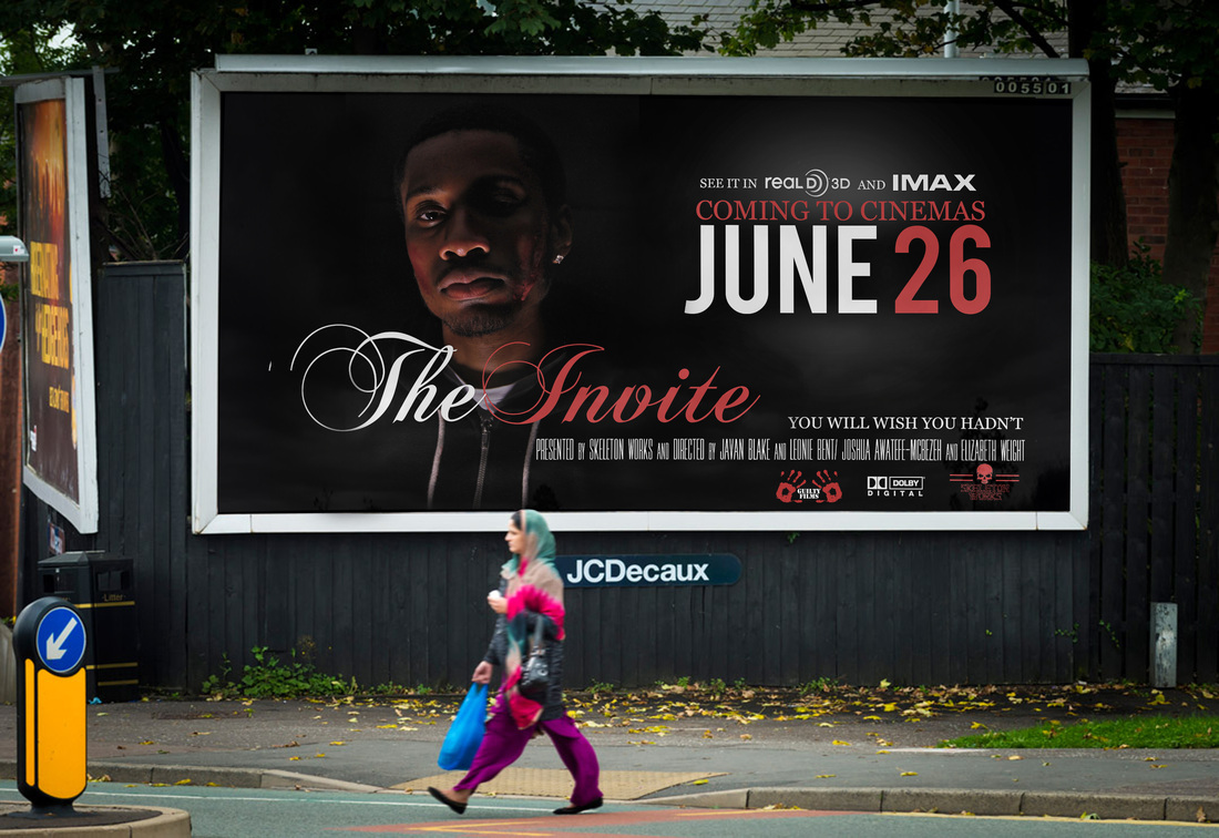
FILM POSTER ON A BILLBOARD
|

FILM POSTER ALTERED TO FIT BILLBOARD (CLOSE UP)
|
Above shows our film poster on a billboard in London. It has been altered to fit the size of the billboard. The option of viewing the film in 3D and in IMAX cinemas have been added, along with the rearrangement of the conventions. Unlike the bus stop advert for the film, this billboard poster has the film's release date on it in big, bold font using the colours red and white. The size of the billboard is a lot larger than the bus stop so, the poster will catch many people's attention; especially to those who are driving past.
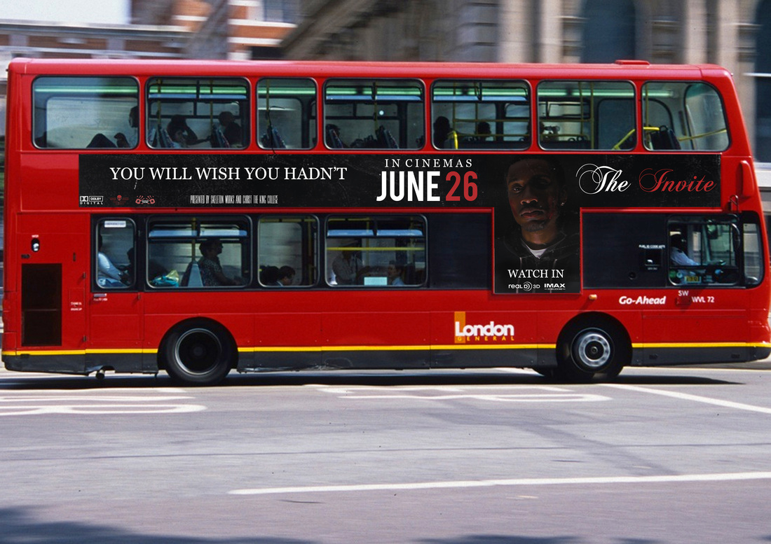
FILM POSTER PLACED ON BUS
|

FILM POSTER ALTERED TO FIT ON THE SIDE OF A DOUBLE DECKER BUS (CLOSE UP)
|
On the left-hand side, there is The Invite's film poster on the side of a bus. A lot has been changed to make this poster work well on the bus. The image of the protagonist has been placed near to the front of the bus, so you can see a close-up shot of him. The title of the film has been placed at the front, the tagline at the tail of the bus along with the company logos, and the release date is in the middle. So far, all the adverts have shown continuity because they all have the same fonts, pictures and colour schemes incorporated in them.
ADVERT ON THE HOMEPAGE OF YOUTUBE & FILM POSTER EDITED FOR TARGET AUDIENCE (CLOSE UP)
On the right-hand side, there is the international trailer for our film, The Invite. The Youtube play button has been placed over the trailer for the audience to watch. The trailer has been placed on the homepage for the audience to see. A huge benefit for the film to be successful is for it to be an international film. Underneath the film title, 'international trailer #1' has been placed. It also says it's the first trailer, so it would excite fans to see new trailers regarding the film. At the bottom of the advert, links to the website, gallery, store and downloads have been placed. This encourages the fans to be more interactive, instead of just sitting there and watching a trailer. The continuity of this advert still stands although it looks completely different from the other adverts you have previously seen. The same fonts and colour scheme have been used. The images are not the same, but still relate to the film because, both the antagonist and the protagonist are shown.
THE INVITE'S ORIGINAL SOUNDTRACK
|

THE INVITE'S ORIGINAL SOUNDTRACK VIEWED ON APPLE'S iTUNES
|
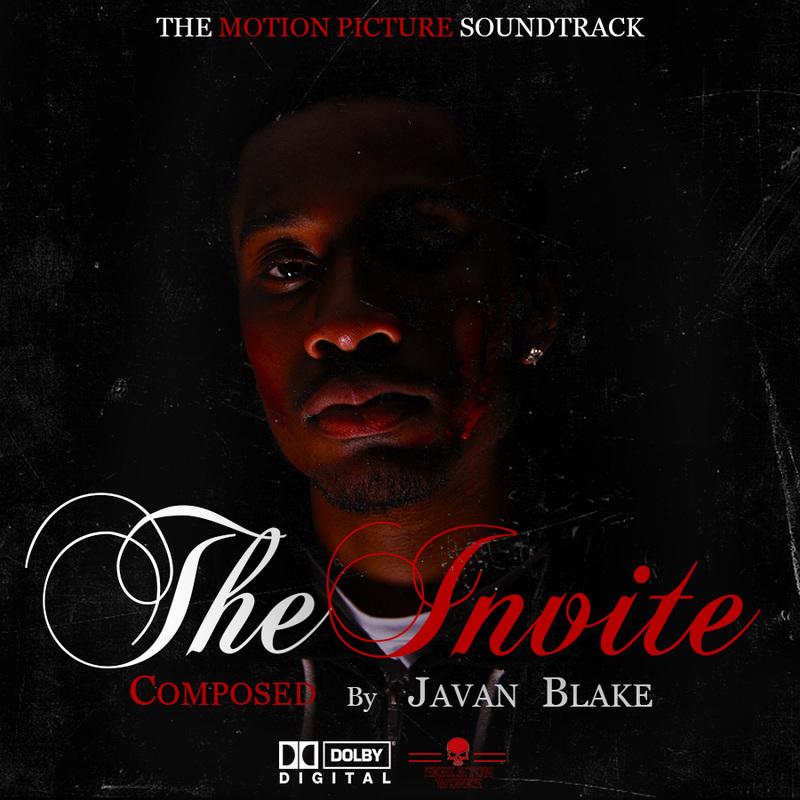
This is the original soundtrack created for our film, The Invite. On the left shows the cover of the CD, and on the right shows the track list for the original soundtrack. The CD cover has the film title in a large font so it is easily recognised by our audience. This shows continuity because we used the original font for the trailer, poster and magazine cover along with the red and white colour scheme. At the top of the CD cover, 'The Motion Picture Soundtrack' has been written in capitals. The font used matches the design of the CD cover. The words 'Motion Picture' have been written in the colour red so it is known that the soundtrack is for a film and not something made by a well-known artist or made for a TV show. Underneath the title, the composer's name has been placed. Javan Blake's name has been placed (He created the sound for the trailer). Also, underneath the composer's name, the sound, production and distribution companies have been added. This also shows continuity within the film poster because, these logos are on the poster. The track list for the soundtrack is being viewed on iTunes so it is open to whoever wants to listen/purchase the album. The album has 15 songs. As you can see, the most popular songs on the film's soundtrack is; 'The Invitation', 'Dark Sense', 'Just a Group of Friends' and 'Lose Something'. On the left, it shows the CD cover as a thumbnail (the larger image can be viewed on the left), with the price of the CD underneath (£8.99), ratings, when it was released (December 31st. 2014) and the copyright. The audience really like the album because it has 1,260 reviews, and a 4.5 rating.
SINGLE CREATED BY AN A-LIST CELEBRITY, PHARRELL WILLIAMS
|
SINGLE CREATED BY PHARRELL WILLIAMS VIEWED ON YOUTUBE
|

CLOSE UP OF THE SINGLE CREATED BY PHARRELL WILLIAMS
|
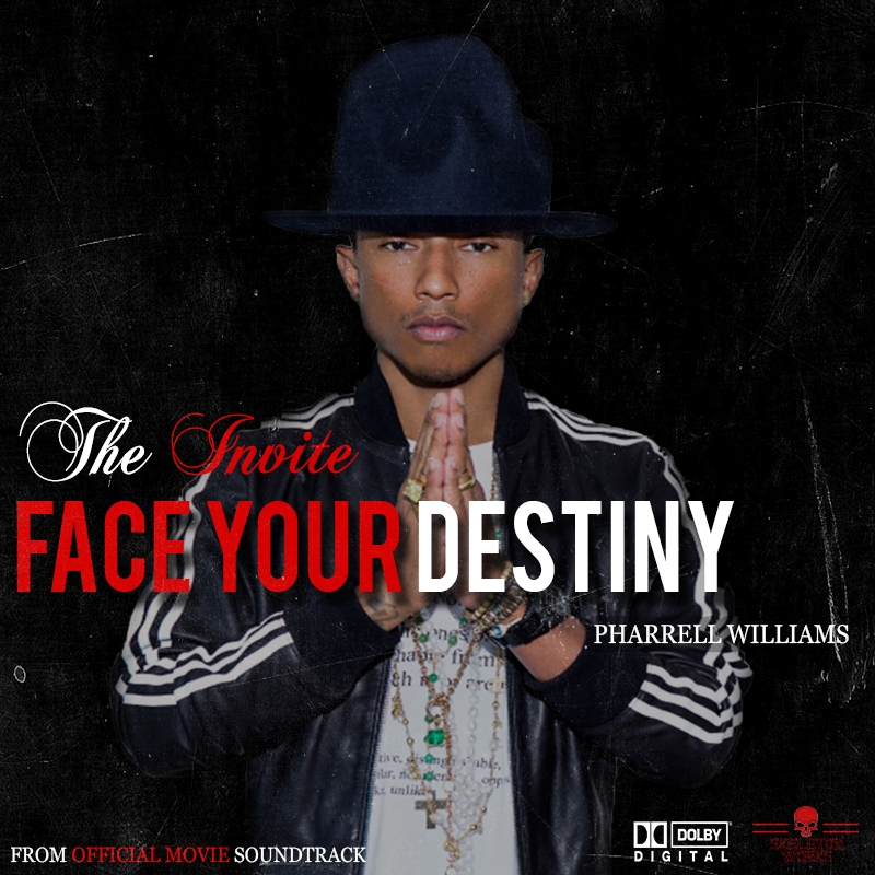
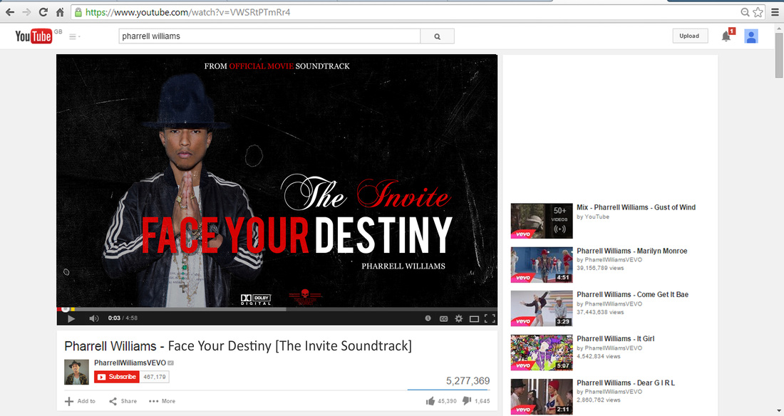
Here is the single named, 'Face Your Destiny' by Pharrell Williams. For a film's , it's good to have an A-list celebrity contribute to the soundtrack because, it will help to publicise the film. The title of the film is in a small sized font, with the name of the song; 'Face Your Destiny' in a large type font with a drop shadow on it. In the bottom-left of the single CD cover, it says 'From Official Movie Soundtrack', with the sound and production company logos on the right. The single CD cover has a filter over it, to make the cover look distorted with scratches all over it (first image on the left). The image in the middle shows the single being viewed on Youtube. You can see that the song has been viewed by over 5,000,000 people; with 45,390 thumbs up and 1,645 thumbs down. This means that the song is quite popular and very much liked. The song has also been posted by Pharrell's Youtube account, so the song will certainly reach millions of people, because he is a well known recording artist. The last image on the right shows a close up image of the single being viewed on Youtube. As you can see in 3 images, there is continuity being showed throughout because, the same fonts are being used, along with the company logos and the red and white colour scheme, like the rest of the products that have been created.
|
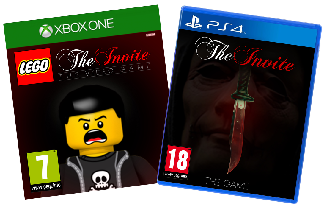
These are the 2 games developed from our film, The Invite. The game available on 2 platforms; XBOX ONE and Playstation 4. Not all ages are available to play both games. For the XBOX ONE game, people ages 7 and up are able to play and for the PS4 game people ages 18 and up are able to play. For the XBOX ONE game, our film has been adapted from the LEGO building blocks. The LEGO franchise is extremely popular with children and adults so they will be drawn to this type of game. The cover art of the game is of a LEGO man yelling, he is wearing all black clothing and has black hair. He is in front of a red and black background, with the title of the film above him and 'The Video Game' underneath it. Beside the name of the film, has the LEGO logo. Also, since the age certificate is 7 and up, almost everyone can play. But, for the PS4 game, the cover art is a bit more graphic due to the age certificate, which is an 18+. On the cover of the PS4 console game, there is a bloody knife with the masked killer's face faded out behind it. This cover art will appeal more to the older audience rather than the XBOX ONE cover art, which would appeal more to the younger audience. Continuity is being shown throughout both products; the XBOX ONE game includes our red and white colour scheme along with green and yellow for the XBOX ONE logo, the age certificate and the LEGO logo. The PS4 game also has our red and white colour scheme, but also includes blue due to the packaging from Playstation. Out of both of the games, the PS4 game resembles our main products; the trailer, poster and magazine. |

ADVERT FOR CONSOLE GAMES ADAPTED FROM THE FILM
This is the advert for our console games. On the left shows the shops where the games would be available; HMV, ASDA, WHSmith and Amazon. The advert features both of the games on 2 different platforms; XBOX ONE and PS4. In the bottom left corner shows our production logo, Skeleton Works. The logos for XBOX ONE and PS4 are underneath the images of the games, and our film title is at the top of the advert.

|

|
FILM SHOWN ON ODEON WEBSITE
Here shows our film being featured on the ODEON website. The image on the left shows a picture of the Masked Killer taken from our trailer for The Invite. Under the picture of The Masked Killer shows the age certificate for the film (which is an 18) and the film's rating, 5 stars. Having such a high rating will encourage the audience to see the film. The image on the right shows our film on the 'What's On Right Now?' page of the ODEON website. Our film is being featured along with other recently released films. The film has the 18 age certificate underneath the poster along with 5 bars of buzz. Buzz is how much the film has been spoken about in the film industry. Our film can also be viewed in The Gallery in the ODEON; as well as in the usual screening rooms.
OUR FILM PROFILE ON IMDb
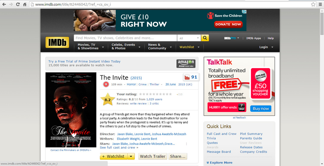
This image is of our film on the IMDb website. On the left of the page shows our poster for The Invite. This shows continuity because we used the original poster for our film, The Invite. At the top of the page has the title of our film along with the year it was released (2015), the age certificate, how many minutes long the film is and the film's genre - horror, crime and thriller. The date of the film's release is again listed this time, with the specific release date; 26 June, 2015 in the UK. In addition to that information about the film, there is a film rating. The rating for our film is 8.2 stars out of 10 from 1,029 people who have an IMDb profile. There are also options to write a review on the film. The website has a synopsis of our film, the names of the directors, writers and actors, underneath that, there are links for adding the film to a viewer's watch list, viewing the trailer and to share the page with others on different social media platforms; i.e. Facebook, Twitter, Tumblr, Google+, etc. On the right, it shows a 'Quick Links' section where people are able to view the full cast and crew, the plot summary (synopsis), trivia, quotes, etc. This is available to anyone who wants to know information about our film.
|
Here shows our film and app viewed on Apple's iTunes Store. When our film comes out of the cinemas, options for buying the film in different formats will be available for the public. One way will be through the iTunes store. The image on the left shows our film being viewed on the 'Films' section on Apple's iTunes Store. You can see that our film is in the featured section of the iTunes app. Below that shows a banner of our film saying 'early release' underneath it. The banner shows continuity because we used the red and white colour scheme for the fonts used and the dark lighting in the close up shots of the images. What's different from the original poster and the banner are the images used. They're not the same as the one on the poster. Instead, the image of The Masked Killer is from the trailer and the image on the right is from our photo shoot for the poster, and is of the protagonist, of our film, Kenny. The image on the right shows our film once you've clicked on the banner. The background isn't the typical dark grey that Apple usually uses for the film section. Instead, it's red. This shows continuity because the colour scheme for our products are red, white and black. The banner of our film remains at the top of the page. Below, is a synopsis of our film and our film and which is £13.99 and our app which is £1.99. The app also shows continuity because of the black, red and white colour scheme, and our film logo is the same as our other main products; the poster, trailer and magazine cover. The second image shows our app being viewed on Apple's App Store. As you can see, our app is number one on the 'Top Charts' list. Sometimes, companies do a promotion where their apps can be purchased for free. So, that's why our app is free here and not free on the iTunes Store (we wanted to show that our app is free for a limited amount of time). Our app has a rating of 3 stars out of 5, and has 2,868 reviews. The two last images in the slide show are a close up of our film's banner and our app on the iTunes page. |
OUR FILM & APP ON APPLE'S iTUNES
|
OUR BOOK ON APPLE'S iBOOK APP
This is the book for our film, The Invite. The cover of the book shows continuity because, it resembles the PS4 cover art, and the film's logo is at the top of the book and the black, red and white colour scheme still exists in this product. The author of the book is at the bottom. The second image shows the book for our film being viewed on Apple's iBook app. As you can see, the book is in the 'Paid' section, so it isn't free to the audience.

|
This is the advert for the DVD of our film, The Invite. Our film would be available on 2 DVD platforms;, Blu-Ray and DVD. Continuity is being shown in both products because, they use the same colour scheme, fonts and image. These two products also resemble our other products for advertisement. At the top of the DVD advertisement shows the Blu-Ray and DVD logos in blue and black. on the left shows where the DVD's are available for purchase; HMV, ASDA, WHSmith and iTunes for digital download. On the right shows the Blu-Ray and DVD images. This will give the consumers a visual on what the DVD will look like when they decide to buy it. |
|
ADVERT FOR OUR FILM RELEASED ON DVD/BLU-RAY
This is a billboard of our film being advertised for SKY TV. Out of all of our marketing products shown so far, this one shows the least continuity as it only shows an Image of the antagonist from our film, The Masked Killer. In previous products The Masked Killer has been seen in our Youtube advert, ODEON cinema feature, film banner for iTunes, book cover and PS4 cover art. So this product shows a small amount of continuity. The film's logo is not featured on this SKY TV advert because, by now, the audience (and fans of the film) should know who is in the film. Having The Masked Killer, who is the antagonist of our film, The Invite, on the billboard will capture the audience's attention, and they will recognise him straight away. On the billboard, the SKY logo has been placed on top of the main image, with 'coming soon' written underneath it. The SKY Movies HD logo has been placed in the right-hand corner. |
SKY TV BILLBOARD ADVERT
|

OUR FILM VIEWED ON AMAZON PRIME VIDEO
|
Here shows a TV with Amazon Prime Video on it. Our film, The Invite is the first film from the left with the yellow boarder around it. The image used for our Amazon Prime TV poster has been taken from the photo shoot we did for our film's poster. The poster features the protagonist of our film, Kenny (Javan Blake). This shows a little more continuity compared to the previous SKY TV billboard advert. The image is not the original image used for the film's poster, but it is part of the photo shoot we did. This image has been featured in a few of our other marketing products; Youtube advert, iTunes film banner and DVD covers. So it shows some continuity. Also, the film logo is in the top right-hand corner. A majority of our other marketing products have our film logo on them. Our film has a 5 star rating from 396 people. This means many people enjoyed our film. |

OUR FILM VIEWED ON NETFLIX
This image shows our film being featured on Netflix. The image for the poster used is not the original photo, but is part of the photo shoot we did for the film's poster. The rest of the layout, colour scheme and fonts used for the poster is the same as the original poster so, this shows continuity.

MERCHANDISE
This is the merchandise created for our film, The Invite. We created 3 products, a mug, t-shirt and a USB. All of the products are white and have the film's logo in black and red. This shows continuity because, the red, black and white colour scheme is being used, and the film's logo is being featured.

THE INVITE RIDE AT AMUSEMENT PARK, THORPE PARK
This is the poster for the ride developed from our film, The Invite. This shows continuity because, the image of the antagonist is being featured, but the image is transparent. This is the same image used in a few of the other marketing products. On top of the image, is the film's logo, this time, the logo is all white instead of white and red. At the bottom are the company logos; Skeleton Works (in red), Dolby Digital (in white) and Thorpe Park (blue and orange). In the bottom middle of the ride's poster is the website for the ride and the copyright. This poster shows continuity because, the image of the antagonist is being used, as well as the film's logo and the fonts.
